Car Banner Design Background Ideas That Stand Out
Creating a standout car banner design background is easier than you think. Whether you are designing for a car show, dealership, or racing team, the right background makes all the difference. This guide shares proven ideas, practical tips, and expert insights to help you craft banners that truly pop. You will learn about color schemes, layout tips, and common mistakes to avoid.
Have you ever walked past a car show and stopped dead in your tracks because a banner stopped you cold? That is the power of a great car banner design background. The right background does not just fill empty space. It sets the mood, draws the eye, and makes the whole banner feel professional and polished.
Whether you are designing a banner for a dealership, a racing team, or a car meet, the background you choose can make or break the entire design. A dull background fades into the wall. But a strong one grabs attention from across the parking lot. In this article, we will walk you through the best car banner design background ideas, share practical tips, and help you avoid the mistakes that hold most people back.
Key Takeaways
- Choose high-contrast backgrounds: Bold colors and clean designs make your car banner design background instantly visible from a distance.
- Match the banner to the event: Different occasions call for different styles, from sleek dealership banners to energetic racing banners.
- Less is more: Avoid clutter by keeping the design simple and focused on the vehicle or message.
- Use professional tools: Canva, Adobe Illustrator, and Photoshop offer templates and features that simplify the design process.
- Test before printing: Always review your design on screen and in print to catch errors and ensure colors look right.
- Lighting and placement matter: Even the best banner design background falls flat if hung in poor lighting or the wrong spot.
- Stay on-brand: Consistency with your brand colors, fonts, and logo builds trust and recognition.
- Why Your Car Banner Design Background Matters
- Top Car Banner Design Background Ideas
- Choosing the Right Colors for Your Car Banner Design Background
- Common Mistakes to Avoid in Car Banner Background Design
- Tools and Software for Designing Car Banner Backgrounds
- Expert Insights on Creating Memorable Car Banner Backgrounds
- Quick Tips for a Perfect Car Banner Design Background
- Comparison Table: Best Background Styles for Different Banner Types
- Conclusion
- It creates visual hierarchy: A strong background guides the viewer’s eye straight to the most important part of the banner.
- It sets the tone: A dark, sleek background feels premium. A bright, colorful one feels fun and energetic.
- It improves readability: The right background makes text easy to read from far away.
- It builds brand identity: Consistent backgrounds across your banners help people recognize your brand instantly.
- It increases engagement: People are more likely to stop, look, and take action when a banner looks professional.
- Black and Gold: Premium, luxurious, and attention-grabbing. Perfect for high-end car brands and exclusive events.
- Blue and White: Clean, trustworthy, and professional. Ideal for dealerships and family car promotions.
- Red and Black: Bold, energetic, and intense. Great for racing teams and performance vehicles.
- White and Green: Fresh, eco-friendly, and modern. Works well for hybrid and electric car marketing.
- Dark Gray and Orange: Industrial yet vibrant. A strong choice for aftermarket parts and customization brands.
- Use a grid system to align elements and maintain visual balance.
- Limit your font choices to two or three per banner for a clean look.
- Add a subtle texture to solid color backgrounds to prevent them from feeling flat.
- Include your logo in a consistent position on every banner for brand recognition.
- Leave breathing room around text and images so the design does not feel cramped.
- Use high-resolution images only, and always check them at 100% zoom before finalizing.
- Save your work in multiple formats so you have options for print and digital use.
📑 Table of Contents
Why Your Car Banner Design Background Matters
People form opinions fast. Studies show that viewers decide if a banner catches their interest within seconds. The background plays a huge role in that first impression. A messy or boring background tells people to keep walking. A well-designed one pulls them in.
Think of the car banner design background as the stage for your vehicle or message. The car or text is the star. The background supports that star by adding depth, color, and focus. Without a good stage, even the best performer struggles to shine.
Here is why getting your background right matters so much:
Quick Tip
Before you start designing, ask yourself one question: What feeling do I want people to have when they see this banner? Speed? Luxury? Fun? That answer should guide every choice you make for the car banner design background.
Top Car Banner Design Background Ideas
Not sure where to start? Below are some of the most effective car banner design background ideas that work across different events and purposes. Each one comes with its own vibe and visual strengths.
1. Gradient Color Backgrounds
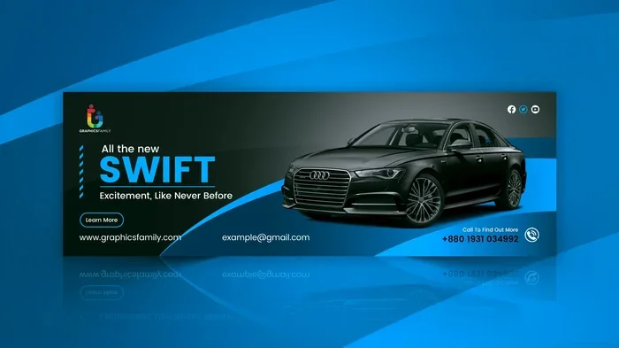
Gradient backgrounds have become hugely popular in banner design, and for good reason. They blend two or more colors smoothly, creating a sense of depth and movement. A deep blue fading into black, for example, gives a sleek, high-end feel that works perfectly for luxury car banners.
Gradients also help you avoid the flat, boring look that plagues many banners. They add dimension without being distracting. Pair a gradient car banner design background with white or yellow text for maximum contrast and readability.
2. Abstract Geometric Patterns
Geometric shapes like triangles, hexagons, and lines can create a modern, dynamic feel. This style works especially well for racing teams and performance-oriented brands. The sharp angles in geometric patterns echo the speed and precision of cars.
You can use a single color on a dark background or go bold with multiple colors. Just keep the patterns subtle enough that they do not compete with the main subject of the banner. A clean car banner design background with geometric accents looks professional without feeling cluttered.
3. Realistic Car Silhouette Backgrounds
This approach uses a large, semi-transparent silhouette of a car as the background. It immediately tells the viewer what the banner is about. A red silhouette on a white background, or a black silhouette on a gradient, creates a striking visual effect.
Realistic car silhouette backgrounds work great for vehicle banner design at dealerships and car events. They add a personal touch and make the banner feel relevant to the audience. Just make sure the silhouette does not overpower the text or other elements on the banner.
4. Speed Lines and Motion Blur
If you want to convey speed and energy, speed lines are hard to beat. These horizontal or diagonal lines radiate from the center of the banner, creating a sense of movement. This style is a staple in racing team banner design and motorsport advertising.
You can pair speed lines with a dark car banner design background and bright accent colors. The contrast makes the lines pop and gives the entire banner a dynamic, action-packed feel. This approach works especially well for banners promoting track events or car launches.
5. Minimalist Solid Color Backgrounds
Sometimes the simplest approach wins. A solid color background, when paired with the right typography and layout, can look incredibly clean and professional. Black, white, deep red, and navy blue are popular choices for automotive banner background designs.
The key to a successful minimalist background is balance. Every element on the banner needs to earn its place. Use generous white space, strong fonts, and high-quality images of the car. A minimalist car banner design background lets the vehicle speak for itself.
6. Cityscape and Road Backgrounds
A city skyline or a winding road in the background instantly tells a story. It places the car in a real-world setting and sparks the viewer’s imagination. Nighttime cityscapes with glowing lights make for particularly stunning car advertisement background designs.
This style works well for lifestyle branding and luxury car promotions. It helps the viewer picture themselves behind the wheel. Just keep the background image slightly blurred or faded so it does not compete with the foreground elements.
Choosing the Right Colors for Your Car Banner Design Background
Color is one of the most powerful tools in banner design. The wrong color combination can make your banner hard to read and forgettable. The right combination can make it unforgettable. Let us break down what works and why.
Understanding Color Psychology in Banner Design
Different colors trigger different emotions. Red evokes excitement and energy. Blue suggests trust and professionalism. Black feels premium and luxurious. Green represents growth and eco-friendliness. When choosing colors for your car banner design background, think about the message you want to send.
For a dealership promoting family-friendly vehicles, blue and white might be the perfect combination. For a racing team, red and black scream power and speed. A luxury brand might stick with black, gold, and deep purple to convey exclusivity.
Color Combinations That Work
Here are some proven color pairings for vehicle banner design backgrounds:
Quick Tip
Always test your color choices on both screens and printed banners. Colors can look very different on a monitor versus in real life. Request a proof or sample before committing to a large print run for your car banner design background.
Common Mistakes to Avoid in Car Banner Background Design
Even experienced designers make mistakes. The good news is that most of these errors are easy to avoid once you know what they are. Here are the most common pitfalls when designing a car banner design background.
1. Using Too Many Colors
It is tempting to throw every color into the design, but this usually creates visual chaos. Stick to two or three main colors for the background. Use additional colors sparingly for accents and highlights. A focused color palette makes your banner look professional and cohesive.
2. Choosing Low-Resolution Images
A blurry or pixelated background ruins an otherwise great design. Always use high-resolution images and vector graphics for your automotive banner background. For print banners, aim for at least 300 DPI. For large-format prints, this is especially important because the viewer is often standing several feet away.
3. Ignoring the Viewing Distance
Where will the banner be displayed? A banner at a car show might be viewed from 10 feet away. A billboard banner could be viewed from 100 feet. Your background design needs to work at the intended viewing distance. Large text and simple shapes work best for far-away viewers. Fine details can shine in closer settings.
4. Forgetting About Contrast
If your text blends into the background, people will not read it. Always ensure strong contrast between the text and the car banner design background. Dark text on a light background or light text on a dark background are the safest choices. Use tools like contrast checkers to verify readability.
5. Overloading the Design
More does not always mean better. Cramming too many elements into a banner creates confusion. Let the background do its job: support the main message. Keep the design clean, focused, and easy to understand at a glance.
Tools and Software for Designing Car Banner Backgrounds
You do not need to be a professional graphic designer to create a stunning car banner design background. There are many tools available that make the process accessible to everyone, from beginners to pros.
Canva
Canva is one of the most popular design tools for beginners. It offers hundreds of banner templates, including options specifically for automotive and car-related designs. You can customize colors, fonts, and images with just a few clicks. Canva is free to use, with premium features available for more advanced needs.
Adobe Photoshop
Photoshop is the industry standard for image editing and banner design. It offers powerful tools for creating gradients, applying filters, and compositing images. If you want full control over your car banner design background, Photoshop gives you the flexibility to create something truly unique.
Adobe Illustrator
Illustrator is perfect for creating vector-based backgrounds. Unlike raster images, vectors scale to any size without losing quality. This makes Illustrator ideal for banners that need to be printed in large formats. Geometric patterns, typography, and abstract designs all shine in Illustrator.
GIMP (Free Alternative)
GIMP is a free, open-source alternative to Photoshop. It offers many of the same features, including layers, filters, and color adjustment tools. While the interface is less polished, GIMP is a solid choice for creating vehicle banner design backgrounds on a budget.
Figma
Figma is a web-based design tool that is gaining popularity for banner and graphic design. It is collaborative, meaning multiple team members can work on the same design in real time. Figma also offers a wide range of templates and plugins that simplify the design process.
Expert Insights on Creating Memorable Car Banner Backgrounds
We spoke with several professional banner designers and automotive marketers to get their top tips for creating standout car banner design background designs. Here is what they had to say.
Start with the end in mind. Before you open any design software, define the goal of your banner. What action do you want people to take after seeing it? Visit your dealership? Sign up for a race? Buy a ticket to a car show? Every design choice should support that goal.
Use the rule of thirds. This classic design principle divides your banner into a 3×3 grid. Place your most important elements along the grid lines or at the intersections. This creates a natural visual flow that feels balanced and pleasing to the eye.
Invest in quality photography. If your banner features a real car, use a high-quality photo. A stock photo that looks generic will undermine the professionalism of your entire banner. Consider hiring a photographer or using premium stock image sites.
Keep the file format in mind. For print, use PNG or TIFF formats with a CMYK color profile. For digital displays, use RGB and formats like JPG or PNG. Using the wrong format can result in dull colors or blurry prints for your auto banner design.
Get a second opinion. Before finalizing your design, show it to someone who was not involved in the process. Fresh eyes can spot problems you might have missed. They can also tell you if the banner communicates the intended message clearly.
Quick Tips for a Perfect Car Banner Design Background
Here are some quick, actionable tips you can apply right away to improve your car banner design background:
Comparison Table: Best Background Styles for Different Banner Types
| Banner Type | Best Background Style | Recommended Colors | Why It Works |
|---|---|---|---|
| Car Show Display | Gradient or Cityscape | Dark blue, black, white | Creates a premium, immersive feel |
| Dealership Promotion | Minimalist Solid Color | Blue, white, silver | Looks clean, trustworthy, and professional |
| Racing Team Banner | Speed Lines or Geometric | Red, black, orange | Conveys energy, speed, and power |
| Electric Vehicle Launch | Abstract Geometric or Gradient | Green, white, light blue | Communicates innovation and eco-friendliness |
| Car Meet or Cruise Event | Abstract Patterns or Silhouette | Black, neon colors | Feels edgy, fun, and youth-oriented |
| Aftermarket Parts Advertisement | Motion Blur or Dark Gradient | Black, carbon gray, red accents | Looks aggressive and performance-focused |
Conclusion
Designing a car banner design background that truly stands out is both an art and a science. It requires a good eye, a solid understanding of color and layout, and a willingness to experiment. The ideas and tips in this article should give you a strong foundation to work from, whether you are creating a banner for a dealership, a racing team, or a car show.
Remember, the best car banner design background is one that supports your message, matches your brand, and captures attention from the first glance. Keep it simple, use high-quality visuals, and always test your design before sending it to print. With the right approach, your banner will not just blend in. It will stand out and leave a lasting impression on everyone who sees it.
Now it is your turn. Pick an idea from this guide, fire up your favorite design tool, and start creating. Your perfect car banner design background is just a few clicks away.
Frequently Asked Questions
What size should my car banner design background be?
The size depends on where the banner will be displayed. For a standard pull-up banner, 30 inches by 80 inches is common. For a large outdoor banner, you might need 6 feet by 10 feet or larger. Always check the specific dimensions required by your printer or display vendor before you start designing your car banner design background.
Can I use a free image for my car banner design background?
Yes, but make sure the image is high resolution and properly licensed. Websites like Unsplash, Pexels, and Pixabay offer free, high-quality images that work well for banner backgrounds. Avoid low-resolution images, as they will look blurry when printed at large sizes.
What is the best file format for printing a car banner design background?
For print, use PNG or TIFF files with a CMYK color profile. These formats preserve image quality and color accuracy. Avoid JPEG for print whenever possible, as it uses lossy compression that can degrade the final output of your car banner design background.
How do I make my car banner design background look professional?
Focus on simplicity, high contrast, and clean typography. Use no more than three colors, choose readable fonts, and leave plenty of white space. A professional car banner design background feels intentional and uncluttered, guiding the viewer’s eye to the most important elements.
Should I use a photo or a solid color for my car banner design background?
It depends on your goal. Photos add depth and storytelling, making them great for lifestyle and luxury banners. Solid colors create a clean, focused look that works well for dealership promotions and minimalist designs. Many successful banners combine both, using a solid color with a subtle photo overlay for the car banner design background.
How can I test if my car banner design background will work before printing?
View your design on a large monitor at 100% zoom. Print a small test copy on your home printer. Ask friends or colleagues for feedback. If the design looks clear, balanced, and readable on a small scale, it will likely look even better when printed at full size for your car banner design background.
=== END ===