All Car Brand Logos Ranked By Popularity and Style
All car brand logos tell a story about identity, heritage, and style. This guide ranks the most popular and stylish car logos, from luxury brands to everyday favorites. You will learn the history, meaning, and design secrets behind the world’s most famous car emblems.
Key Takeaways
- Car brand logos reflect brand values: Every emblem carries a story about the manufacturer’s roots, mission, and design philosophy.
- Popularity and style are not the same: Some logos rank high in recognition but may lack modern design appeal, and vice versa.
- Luxury car logos use specific design cues: Elegant typography, shield shapes, and animal symbols dominate premium brand identities.
- Car emblem evolution is fascinating: Many iconic logos have changed dramatically over the decades to stay relevant.
- Color and simplicity matter: The best car brand logos are simple, memorable, and work in any size or format.
- Understanding logo meanings adds appreciation: Knowing what hides inside a car emblem makes you a more informed car enthusiast.
- Fake logos are common: Learning authentic design details helps you spot counterfeit car merchandise and parts.
📑 Table of Contents
- Why Car Brand Logos Matter More Than You Think
- The Most Popular Car Brand Logos in the World
- Luxury Car Logos That Stand Out
- The Evolution of Car Emblem Designs
- What Makes a Great Car Logo
- Quick Tips for Car Logo Fans
- Common Mistakes People Make About Car Logos
- Expert Insights on Automotive Branding
- Key Takeaways
- Conclusion
Why Car Brand Logos Matter More Than You Think
Think about your favorite car. What comes to mind first? For most people, it is the car brand logo. That little symbol on the grille or steering wheel carries enormous weight. It represents decades of engineering, design philosophy, and brand identity.
Car brand logos are not just decorative shapes. They are powerful marketing tools. A great emblem builds trust, creates emotional connections, and signals quality. When you see a certain logo, you instantly know what kind of car it is. You might associate it with speed, luxury, reliability, or innovation.
The automotive industry is incredibly competitive. Thousands of automotive logos exist worldwide. Only a few achieve true global recognition. Brands like Mercedes-Benz, Toyota, and BMW spend millions perfecting their car emblem designs. They understand that a strong logo drives sales and builds lasting loyalty.
But popularity is not the only factor. Style matters just as much. Some car brand logos are timeless masterpieces of graphic design. Others feel dated or overly complicated. Ranking logos by both popularity and style gives us a fascinating look at what makes a truly great car symbol.
In this article, we will explore all car brand logos in a new way. We will rank them, analyze their designs, and uncover the stories behind the most famous auto manufacturer symbols. Whether you are a car enthusiast or just curious, this guide will deepen your appreciation for automotive branding.
The Most Popular Car Brand Logos in the World
When we talk about popularity, we look at global recognition, market presence, and consumer trust. These are the car brand logos that people around the world instantly recognize.
1. Mercedes-Benz Star
The Mercedes-Benz three-pointed star is arguably the most recognized automotive logo in history. It represents dominance over land, sea, and air. The logo has remained remarkably consistent since 1909. Its simplicity and elegance make it a gold standard in car emblem design.
The star sits inside a circle, often paired with the brand name. This combination creates a balanced, premium feel. The silver color scheme reinforces the brand’s association with luxury and quality. Few car brand logos have maintained such consistent visual identity for over a century.
2. Toyota Ellipse
Toyota’s overlapping ellipses represent the trust between the brand and its customers. The design also symbolizes the engine’s heart and the world embracing the brand. The Toyota logo is clean, modern, and incredibly versatile.
What makes this logo so popular is its simplicity. It works on a tiny keychain or a massive billboard. The red and white color scheme is bold yet sophisticated. Toyota sells more cars than almost any other brand, and its logo plays a huge role in that success.
3. BMW Roundel
The BMW roundel features a blue and white checker pattern inside a black circle. Many people think the design represents a spinning airplane propeller. In reality, it reflects the Bavarian flag colors. The BMW logo has evolved over the years but kept its core identity intact.
BMW positions itself as the ultimate driver’s car brand. The roundel communicates precision, engineering excellence, and premium quality. It is one of the most famous car logos on roads worldwide.
4. Volkswagen VW Symbol
The Volkswagen VW monogram is deceptively simple. Two overlapping letters create a balanced, stable design. This reflects the brand’s values of reliability, practicality, and accessibility.
As one of the world’s largest automakers, Volkswagen’s logo needs to work across many models and markets. The clean typography and compact shape make it incredibly effective. It is a masterclass in car logo design that prioritizes function over flash.
5. Ford Blue Oval
The Ford blue oval is one of the most enduring symbols in American automotive history. Introduced in 1907, the oval shape represents continuity and completeness. The blue color conveys trust and dependability.
Ford has kept this logo for over a century with only minor updates. That kind of staying power is rare in any industry. The Ford oval proves that sometimes the simplest car brand logos are the most effective.
Luxury Car Logos That Stand Out
Luxury car brands invest heavily in their car emblem designs. These logos must communicate exclusivity, craftsmanship, and prestige. The luxury car logos on this list are true works of art.
Porsche Crest
The Porsche crest features a Stuttgart coat of arms combined with a jumping horse. The crest sits in the center of a black and gold stripe. This car logo tells a rich story of heritage and performance.
Porsche uses this emblem on every vehicle, from the Boxster to the 911 Turbo. The crest feels ceremonial and prestigious. It elevates the car’s perceived value instantly. Few automotive logos carry as much historical weight as the Porsche crest.
Ferrari Prancing Horse
The Ferrari prancing horse is one of the most iconic car logos ever created. The black horse on a yellow background is instantly recognizable. It represents speed, power, and Italian passion.
Enzo Ferrari adopted the horse from the emblem of Count Francesco Baracca, a WWI flying ace. The yellow background honors Ferrari’s hometown of Modena. Every detail in this car brand logo has deep meaning. The prancing horse makes Ferrari cars feel like trophies even before you drive them.
Rolls-Royce Spirit of Ecstasy
The Rolls-Royce Spirit of Ecstasy figurine is the most distinctive element in the automotive world. This elegant female figure with outstretched wings sits atop the hood of every Rolls-Royce.
The brand’s rectangular grille and the flying lady together create an unmistakable silhouette. The luxury car emblem communicates refinement, exclusivity, and old-world elegance. It is arguably the most expensive car logo to produce, given the handcrafted details.
Maserati Trident
The Maserati trident logo draws inspiration from the Fountain of Neptune in Bologna. The three prongs represent the sea, the sky, and the earth. The red and blue colors add energy and sophistication.
Maserati positions itself as a blend of Italian artistry and racing performance. The trident logo feels artistic and bold. It is a car emblem design that stands out in a crowd of more common symbols.
The Evolution of Car Emblem Designs
Car emblem evolution is a fascinating journey through design trends. Early automotive logos were often intricate and detailed. As design sensibilities changed, logos became simpler and more modern.
From Detailed to Minimal
In the early 1900s, car logos were ornate. They featured elaborate illustrations, complex typography, and rich details. Brands like Rolls-Royce and Cadillac had highly detailed emblems that reflected the craftsmanship of the era.
Over time, the industry shifted toward minimalism. The best car brand logos today are clean and scalable. They work on a digital screen, a key fob, or a chrome badge. This evolution mirrors broader trends in graphic design and branding.
Modern Updates and Rebranding
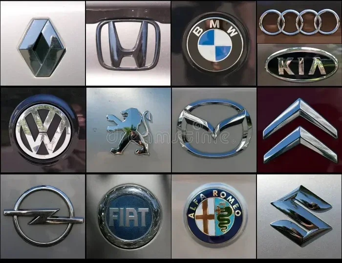
Many brands have updated their car emblem designs in recent years. Audi simplified its four rings. Jaguar refined its jumping cat. Peugeot updated its lion. These changes reflect the desire to feel contemporary while maintaining heritage.
Some auto manufacturer symbols have gone even further. Tesla removed any traditional logo and now uses just the brand name in a sleek typeface. This reflects the electric vehicle brand’s focus on innovation and forward-thinking design.
Retro and Heritage Revivals
Interestingly, some brands are moving in the opposite direction. They are reviving vintage car logo designs to tap into nostalgia. Classic car enthusiasts appreciate when brands honor their heritage. The Ford Mustang and Chevrolet Camaro logos have benefited from this trend.
The best car brand logos balance past and present. They honor their origins while feeling fresh and relevant. This is the sweet spot that every automaker strives for.
What Makes a Great Car Logo
Not all car brand logos are created equal. Some are forgettable, while others become cultural icons. What separates the great from the rest?
Simplicity
The most memorable car emblem designs are simple. Think of the Mercedes star, the BMW roundel, or the Ford oval. These logos work because they are easy to recognize and remember.
Simple logos also scale well. They look great on a tiny keychain or a massive showroom banner. Complexity kills versatility in automotive logos. The best brands understand this principle deeply.
Meaning and Story
Great car brand logos tell a story. The Ferrari horse honors a war hero. The Porsche crest represents a city’s heritage. The Maserati trident draws from classical sculpture.
When a logo carries meaning, it creates an emotional connection. Customers feel more attached to brands with rich stories. This is why car logo meanings matter so much in automotive marketing.
Color Psychology
Color plays a huge role in car emblem design. Red suggests passion and speed. Blue conveys trust and technology. Black signals luxury and power. Gold represents prestige and achievement.
The best luxury car logos use color strategically. They choose palettes that reinforce the brand’s positioning. A sports car brand might use aggressive red, while a premium sedan brand might choose deep blue or silver.
Timelessness
Trends come and go. The best car brand logos transcend their era. A timeless logo looks just as good today as it did fifty years ago. This is the hallmark of truly great automotive branding.
Brands that chase short-term design trends often regret it later. They end up redesigning their logos frequently, which confuses customers. The brands that last are the ones that commit to a design that endures.
Quick Tips for Car Logo Fans
- Study the classics: Look at the oldest versions of famous car brand logos to understand their roots.
- Notice the details: Small design choices like font weight and spacing make a big difference in car emblem design.
- Compare similar brands: Place luxury automotive logos side by side to see how they differentiate themselves.
- Follow design trends: The automotive industry often mirrors broader graphic design movements.
- Visit car shows: Seeing car emblem designs in person gives you a better sense of scale and craftsmanship.
- Read brand histories: Understanding the story behind a car logo makes it more meaningful and memorable.
Common Mistakes People Make About Car Logos
Even car enthusiasts get some things wrong when it comes to car brand logos. Let us clear up a few common misconceptions.
Assuming All Luxury Logos Look the Same
Many people think all luxury car logos feature shields or crests. While many do, the best ones have unique elements that set them apart. The Rolls-Royce Spirit of Ecstasy is completely different from the Porsche crest, even though both are luxury brands.
Thinking Simplicity Means Boring
Some people dismiss simple car emblem designs as boring. But simplicity is actually the highest form of design. The most famous car logos are often the simplest ones. They communicate instantly and stay in your memory.
Ignoring Logo Evolution
Every car brand logo has a history. Many people do not realize that their favorite emblems have changed over the years. Understanding this evolution adds depth to your appreciation of automotive branding.
Expert Insights on Automotive Branding
Professional designers who specialize in automotive logos share a common philosophy. They believe the best car brand logos must work in three dimensions. A logo looks different on a flat screen, a metal badge, and a fabric seat emblem.
These experts also emphasize the importance of cultural sensitivity. A car emblem design that works well in Europe might not resonate in Asia or the Americas. Global brands must create logos that transcend cultural boundaries while still feeling authentic.
Another key insight from industry professionals is the role of motion in modern car logo design. With digital screens becoming standard in vehicles, logos now animate on dashboards and displays. This adds a new dimension to automotive branding that did not exist five years ago.
The best car brand logos also consider manufacturing constraints. A complex logo might look stunning in a rendering but be impossible to emboss accurately on metal. Practical engineering limits shape even the most creative car emblem designs.
One final expert tip: the most successful auto manufacturer symbols feel inevitable. They look like they could not have been designed any other way. This sense of inevitability comes from perfect alignment between the logo, the brand values, and the product itself.
Key Takeaways
- Car brand logos reflect brand values: Every emblem carries a story about the manufacturer’s roots, mission, and design philosophy.
- Popularity and style are not the same: Some logos rank high in recognition but may lack modern design appeal, and vice versa.
- Luxury car logos use specific design cues: Elegant typography, shield shapes, and animal symbols dominate premium brand identities.
- Car emblem evolution is fascinating: Many iconic logos have changed dramatically over the decades to stay relevant.
- Color and simplicity matter: The best car brand logos are simple, memorable, and work in any size or format.
- Understanding logo meanings adds appreciation: Knowing what hides inside a car emblem makes you a more informed car enthusiast.
- Fake logos are common: Learning authentic design details helps you spot counterfeit car merchandise and parts.
Conclusion
All car brand logos deserve recognition for the artistry and meaning they carry. From the iconic Mercedes-Benz star to the elegant Porsche crest, these symbols shape how we perceive the vehicles we drive. They are more than just metal badges. They are the visual heartbeat of the automotive industry.
Understanding car brand logos enriches your appreciation for automotive design and engineering. The next time you see a car on the road, take a moment to notice its emblem. You might discover a story you never knew existed. The world of automotive logos is vast, fascinating, and full of surprises.
Whether you prefer the bold simplicity of the Toyota ellipse or the dramatic flair of the Ferrari prancing horse, there is a car logo for every taste. The beauty of car emblem design lies in its ability to communicate volumes without saying a single word. That is the true power of a great car brand logo.
What is the oldest car brand logo still in use?
The Ford Blue Oval, introduced in 1907, is one of the oldest car brand logos still actively used today. It has undergone minor refinements but retains its core oval shape and blue color. This remarkable longevity speaks to the strength and timelessness of the design.
Which car brand logo has changed the most over time?
BMW and Audi have both made significant updates to their automotive logos over the decades. BMW evolved from a detailed circular emblem to the clean roundel we know today. Audi simplified its four rings from a more complex arrangement to the sleek parallel bars seen now.
Do car logos affect buying decisions?
Absolutely. Car brand logos influence consumer perception and purchasing decisions significantly. A strong, recognizable logo builds trust and signals quality. Many buyers form an immediate impression of a vehicle based largely on its badge and car emblem design.
What is the most copied car logo in the world?
The Ferrari prancing horse is one of the most copied famous car logos in the world. Its distinctive black horse on yellow background is instantly recognizable. Counterfeit car accessories and merchandise featuring variations of this car logo are extremely common globally.
Are electric vehicle brands changing car logo design?
Yes, EV brands are pushing car logo design toward cleaner, more minimalist aesthetics. Tesla uses just its wordmark without a traditional symbol. New electric brands often favor flat, geometric designs that feel modern and technology-forward. This shift reflects the industry’s broader move toward digital and sustainable branding.
How are car logos designed today?
Modern car emblem designs are created using advanced digital tools and 3D modeling software. Designers must consider how the logo will appear on screens, metal badges, and lighting conditions. The best automotive logos are tested across multiple formats and environments before final approval.
Frequently Asked Questions
What is all car brand logos?
all car brand logos is an important topic with many practical applications.